When I first met with Denise Martell (Director & RDSP Presenter for PLAN Okanagan), it was to assess whether or not PLAN Okanagan would be a good fit for my “Design Day for GOOD” initiative. I had never even heard of PLAN Okanagan, nor did I know much about the great work they do for individuals with disabilities and their families. Denise gave me the abbreviated version of the PLAN Okanagan story, and we talked a bit about the programs, resources, workshops, and support networks they provide. All done on a very limited budget, with one part-time staff member, and a lot of volunteer support. Needless to say, it didn’t take much convincing before I knew I needed to help this nonprofit organization refresh its look and help create professional assets that would help them to reach a greater audience and garner more support.

The “Design Day for GOOD” initiative was an idea I borrowed from my friends in the Graphic Designers of Canada Saskatchewan North chapter. It was created as a way to give back to the community while raising awareness about the importance of professional design in creating positive change. The idea is to help nonprofit organizations within the community that do not have the budgets to hire professional graphic designers, web developers, marketers, and strategic planners with one day of design and marketing assistance. However, the inaugural event had to be cancelled as a safety precaution following physical distancing measures put in place due to COVID-19. Everyone prepared to volunteer for the day was disappointed they wouldn’t be able to help out but accepted an indefinite postponement in order to stay safe. This left those nonprofit organizations selected for the event without the help they required for an indefinite period of time, which led me to reach out and ask if there was anything I could do to help with their immediate design needs. PLAN Okanagan was in need of some care and attention. While their Facebook account was alive and bustling with traffic from their community their website and collateral materials were in need of a refresh. Luckily, rebranding is my area of expertise and I could visualize the potential for PLAN Okanagan to showcase its core values in a professional and vibrant way.
I was put in touch with Mary, THE staff member at PLAN Okanagan and we quickly went to work. We went through a lengthy creative brief interview, worked out the details for web hosting, set up an Instagram account, scheduled Zoom meetings, and evaluated the necessary pieces for a new website. Mary was invaluable in the design process as a source of information, support, and inspiration. If PLAN Okanagan were a person it would be Mary.


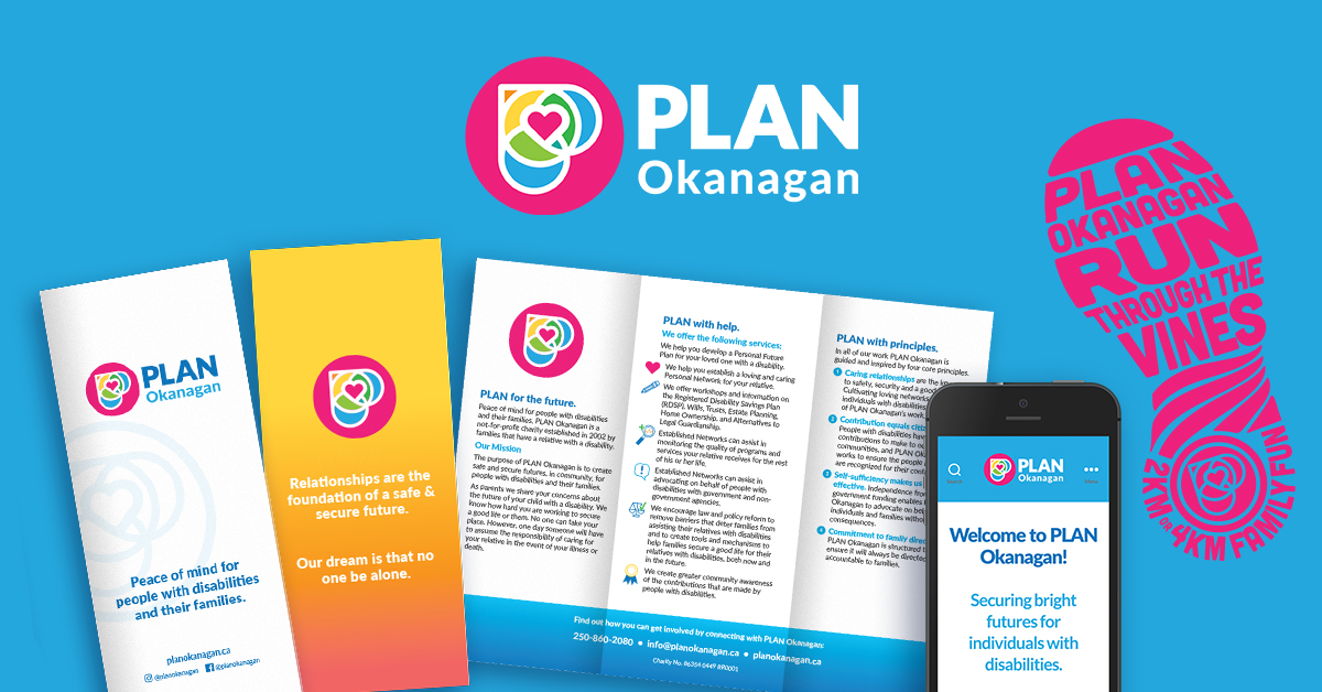
By listening intently to what I was told and reading the content I was given, I was able to tackle the design challenge with a well-informed and meaningful approach. The design of the logo and branding were influenced by the relationship circles of intimacy, friendship, participation, and exchange. The idea of overlapping circles creating a cohesive whole is played with in forming a “P” and heart shape. The heart of the logo represents the relationship circle of intimacy and the individual for whom the plan is built around.
The colours are influenced by the Okanagan with hues of yellow, green, and blue composed in such a way that it almost looks like an Okanagan landscape. Colour theory also helped in selecting the colours of the logo. In colour theory these hues can sometimes represent the following:
Pink – affection, harmony, and approachability. Yellow – sunshine, happiness, and friendships. Green – nature, wealth, stability and renewal. Blue – calm, responsibility, and loyalty.
The font “Lato” was chosen as the perfect pairing to the new logo icon. It was chosen because it is a web-safe font that is easy to read, modern, clean, and professional.
The overall logo represents a uniquely Okanagan PLAN coming together as one cohesive unit. The unique qualities of the logo make it iconic and distinctly different from other logos from similar organizations.
This has been an unbelievably fulfilling project. PLAN Okanagan has been encouraging and receptive to my ideas every step of the way. And we’ve been able to create a rebrand that embodies the caring, supportive, and celebratory nature of PLAN Okanagan. I believe in the power of graphic design to make a positive impact on the lives of others. I may not have the means to donate money to every cause that I want to help out, but I can sometimes provide my skills and services where they will make the biggest impact. I’m grateful for the opportunity that PLAN Okanagan has given me and hope these graphic design assets will help them for years to come.